Architectural Case Studies

Friday, November 03, 2006

Zaha Hadid- Critical Representation

Zaha Hadid- Critical Representation

Although the assignment is to analyze the representational effectiveness of two projects, I feel this is inappropriate for this scope. As an architect, or even as an artist, Hadid has already earned the admiration and respect of the global community, as she deserves. However, the assignment is to “discuss the extent to which you believe the essential aspects of the design are shown in both conceptual representation, and are sufficiently described as works”, and I honestly do not feel any given project achieved that level of comprehensibility.
Perhaps the best represented project in the entire Zaha Hadid exhibit is the Bergisel Ski Jump, but even then I did not obtain a full understanding of all the spaces. Of course, looking at any of the images in that series or the model itself lent an instant understanding that the project was a ski jump ramp, because of the distinctive form that a ski ramp must have. The model for this project obviously helped significantly given the emphatic three-dimensional nature of a ski-ramp. The series of renderings and images helped bring intrigue as to what is located in the main building; she subtly includes people through the windows at the top seated at a high table, which suggested immediately a café type area.

This is immediately where my understanding ends. Why is the building curved as it is? The only justification I can conjure is that it is Hadid’s personal style, and that’s perfectly acceptable, except as a single project examined sui generis, there is no meaning behind the project except a beautiful form. Is there an underlying order or rationale from which the building is generated? I could derive no such base. From the presentation, I could not understand her intent, or parti for the project. Besides space for a café, I did not understand what spaces were inside the top section of the building. There could be an amazing space, overlooking the ski ramp through a glass floor bottom, or some other such experiential moment, but it was not represented in the least. As far as a common person would know from her presentation, it is simply a large storage space, unused by the public.

The only other project for which I had a semblance of comprehension is the Rosenthal Center for Contemporary Art, but that is only because I was somewhat familiar with the building previously. I understood the rounded floor/wall connection and the exploded facades from my previous experience, and learned nothing new from the drawings and sketches provided. However, the model was effective at demonstrating how she viewed the façade elements as intersecting volumes, even if that quality was unintentional.

That is not to say, the forms of representation are at fault, although that may be in some cases. Overall, the quality of craft in the drawings, models, and other representation are extremely high; some drawings were more complicated than others. As paintings in and of themselves, they are very provocative, but as architectural paintings, some of them are far too abstract to accurately depict Hadid’s thoughts about a particular project without some level of subjectivity.
Of the paintings, perhaps the most provocative is her 24 hour representation of Trafalgar Square, which although not patently obvious at first glance, allowed for a greater understanding of how she viewed the buildings at day versus night. It also demonstrated how she views the fabric of the city as an abstract grid of color. Although it may portray her views of the “city”, it provides little (if any) understanding of the relationship between her architecture and the city. Does she consider her buildings superior, and therefore the only object in space deserving of full rendering? To that end, her architecture is not even fully rendered in this painting, it was so far skewed in perspective it did not allow for any rational, or even emotional, understanding of how she envisioned the building, much less how it relates to the city.

Also of interest is her furniture design; why do so many architects find the need to design furniture associated to their names? Although she has a very articulated design aesthetic for her architecture, her furniture, lighting fixtures, and the kitchen prototype was simply arcane. Save the curvilinear form, there was little, if any connection between her ideas in furniture and her ideas in architecture. Even worse, I could not imagine any of her pieces actually being inside any of her spaces; what is the point of designing furniture that severely clashes with one’s own designed spaces? The lack of coherency is clear in the exhibit layout itself; the furniture is placed at the top, and even in a supplemental room where few people will even notice it. It was simply so out of place, I honestly thought it was part of a separate exhibit before reading the placards.

Labels: , , ,

Tuesday, October 31, 2006

On the Implications of Convention in Architecture

On the Implications of Convention in Architecture

There are, I would argue, two major threats to the individuality and creativity of the arts, one of which is the historical study of such, and the other being convention. Both lend themselves to degrade the innate creativity from which the arts is able to separate itself from the sciences. While the former is a viewpoint considered by many past architects, the most prominent of which is probably Gropius, the latter, although directly related, deserves further consideration.
It is impossible to separate convention from architectural history; there exists no convention without history. So it is now important to consider how convention affects young architects in training as well as seasoned designers. To begin, I do concede the point that some conventions are, and should be, accepted as standards. For example, the conventions which are established by legislation, such as ADA and other codes are obviously well examined, criticized, and reviewed to the point that it is considered universally right. That is where other conventions become subjective; what is right? We base the ADA’s “correctness” by justifying it with maintaining the Constitutional mandate of Equal Protection. What justifies the convention of “house”?
Why do houses need to have bedrooms, kitchens, bathrooms, and the other delineation of rooms we tend to associate with “house”? Why do houses need to consider the privacy between the house and the exterior? Although interesting questions, my point is much more general and grand; why are these conventions considering only Western precedents? Architectural history education in American schools is comprised solely of Western and European precedents. The occasional Eastern architectural project is considered only as a token.
The eastern and western architectures both consider the same issues and yet we base our conventions on only western precedents. How can we possibly claim that the conventional ideas referenced in these essays are “transforming” when they may possibly be catching up to a state of evolution already present in other architectures? Is an underdeveloped country “transforming” when all they are doing is mimicking technologies and methodologies embraced by developed countries? Similarly, I would argue that without a complete broad understanding of architecture as a global phenomena, it is impossible to say that the concept of conventionality is transforming, even at a local scale. The writers of these articles cannot even possibly claim they are considering the issues on a local scale, or otherwise they would not have cited projects from other countries and localities.

Having already denounced the consideration of interpretation on its prima fascia “traditional” sense, I will continue to analyze the case study on this traditional definition, for otherwise there would be nothing to discuss. For the sake of this analysis, let us consider the “convention” of materiality is that certain materials are reserved for residential work, and others are for commercial and industrial architecture. In this sense, the Maison de Verre strayed from these constructed conventions in that it explored alternative uses. One could claim that the usage of the materials, including rubber tiling, glass block, and steel columns is a drastic evolution of materiality in the consideration of townhouse design, but I would have to disagree; the rationale is even stated in a reading. As unknown implies in Creating the New American Town House, industrial materials have “latent” residential characteristics (10). If all industrial materials innately have a residential quality, then is it really a transformation to exploit these qualities? I argue it is not a transformation to simply explore alternate uses of materials. Brick was once exclusively a load-bearing material, and was used in interior and exterior walls. Now that we can build brick veneers as non-load-bearing, has it really signed an age of transformation to the convention of “brick”? Is it still not a “heavy” material, implying weather-fastness and strength? We simply explored alternative uses for “brick”, but doing so did not fundamentally change the convention of brick.

Once more, I will revert to the traditional view of “convention” in order to discuss its presence in my own project. Very clearly, the convention of fireplace would be the first aspect to consider. In many cases, if a fireplace is integrated into a residence, it is pushed into a side wall or otherwise made diminutive by insetting it in the center of a wall without consideration. This “transition” is possibly the result of the creation of centralized heating systems; one could argue the purpose of fireplaces was to provide warmth to the residents, and once other systems were developed the need for fireplaces was reduced. It then becomes necessary to consider another ancient typology, the Roman townhouse. Roman townhouses have consistently over a period of several years, included fireplaces; the Romans then developed the first thermal transfer heating system, wherein a fire in the sub floor heats water and a series of pipes pumps the water throughout the building, heating the spaces indirectly. The development of the centralized heating system did not reduce the frequency of fireplace inclusion. I would hypothesize the decrease in fireplace importance in our modern times is a direct result from a reduction in the significance and meaning of “fireplace”, not a typological or conventional transformation resulting from solely the different treatment or usages of fireplaces. The social change affected the architecture, not the other way around. Conventions, resulting from societal changes, result directly as a dialogue between architecture and society, and there cannot be a radical transformation or deviation so severe from the norm without strict criticism and review. My project, though it includes four fireplaces instead of the “traditional” one, cannot be considered a conventional transformation, because I do not change the intent of “fireplace”. I still use it as a point of convergence for the family and social guests, and I still use it to provide light and heat for the residents. Having an element multiple times is not significant enough to constitute a conventional transformation.

Labels: ,

Friday, March 10, 2006

Theater Interaction

Theater Interaction

To consider the common modern theater is to consider antisocialism. Often the edifice is a jumbled maze of unorganized and concealed spaces where individual cliques speak amongst themselves, ignoring or affronting potentially friendly strangers. The architecture lends itself to this self-perpetual cycle of non-confrontational interaction; there are no intimate spaces outside of the actual performance area that encourages social interaction with strangers. This quality of isolation is unreasonable; people should be given spaces where they have some sense of security, while at the same time freedom to interact with strangers, well knowing other strangers are already interacting with them. To that end, the concept of To See and Be Seen is introduced. Visual interaction, from a distance, with the option to convert to a personal conversation, is the easiest way to stimulate interaction between strangers. When this vision occurs from a distance, with voids and barriers in between participants, they feel much more comfortable; it is easier to divert your vision from someone if you are at a distance than when face to face. This sensation, along with a strong emphasis on building performative, is the design intent for the project.

On the Significance of Seeing and Being Seen

On the Significance of Seeing and Being Seen

Consider the modern theater; there are two distinct types, those of the movies and those for more traditional performances, such as plays and musicals. The former is characterized by a lack of interaction between anonymous patrons. People tend to stick within their own groups of friends and people they came with, very rarely meeting or talking to new people. The latter is not much better, patrons might occasionally spark new conversation with people to whom they may be accustomed, or possibly know of peripherally, but very rarely are new relationships started from scratch.
So amidst of this sea of social sterility, what is a comparable to a level of social interaction which is the goal this new theater archetype is attempting to achieve? Surprisingly enough, it is a combination of both film and live theater which provides the only nearest comparison: The Rocky Horror Picture Show. As unusual as it may seem, this level of social interaction is achieved simply by creating a light atmosphere where people are encouraged to speak to one another, even if they are complete strangers. The task at hand now is to reflect this atmosphere in the form, and use the architecture to help facilitate this interaction, while at the same time providing some semblance of structure and organization.
And so we return to the concept of See and Be Seen, of what relevance does it have in the context of social interaction? There are two types of people, those who prefer to have some distance between themselves and other people, and those who prefer intimacy and close quarters. Should the architecture provide both conditions, both types of people will be in a more comfortable environment, and be encouraged to speak to one another. Of course, how does one strike a conversation without first seeing someone else? The architecture should provide spaces where patrons can occupy and view other people, and at the same time participate as an object in the spectacle of viewing. Should the strangers, viewing from a distance, wish to strike a conversation, close and intimate spaces should also be provided. By creating a hierarchy of spaces that facilitate this viewing, and by providing those whom are insecure with a sense of distance and separation, the architecture facilitates the development of social interactions.

Saturday, March 04, 2006

Angkor – Failed Pre-industrial urbanism

Angkor – Failed Pre-industrial urbanism, low density

Some may say that high density urbanism may fail, but low-density urbanism would succeed. This point is refuted with recent studies of the Angkor urban complex. Starting in the 9th century AD, Angkor was the capital of the Khmer empire in Cambodia. At the largest, Angkor could have been up to 1,000 square kilometres in size, supporting up to 700,000 inhabitants, and is considered the largest urban pre-industrial city ever in existence. The historical reason behind the collapse of this city is not known for sure, although there are theories that implicate the failing water infrastructure, which remained neglected by the local government. The governments of the past were unable to adequately provide the stability for a system as basic as water transport; how could they have been able to sustain a population of almost one million? One could also theorize that low-density urbanism is every more difficult to provide support for than high-density, as the same population or support requirements are spread out over a larger geographical area. There seems to be no level of government planned urban housing that can be successful.

George Hellmuth and Minoru Yamasaki - Pruitt-Igoe

George Hellmuth and Minoru Yamasaki - Pruitt-Igoe

Completed in 1956, St. Louis's Pruitt-Igoe housing complex is perhaps the biggest example of how concentrated, high-density urbanism is doomed to fail. After its construction, and until 1972, St. Louis Housing Authority spent more than $5 million in attempts to fix the urban issues that plagued the complex, before giving up and destroying three of the structures. A year later, the remainders of the buildings were demolished after recognizing the project would never work. The architects George Hellmuth and Minoru Yamasaki were appointed by Joseph Darst (the mayor) in 1950, insisted on a modernist high-rise system that, in its totality, housed 2,870 rooms in thirty-three eleven-story buildings.

At the time, segregation was still popular, and so the Igoe apartments were designated for whites and Pruitt apartments were for blacks. For whatever reason, the white population refused to move in, and thus all the apartments were of a black population majority. With complaints about racism and prejudice against the poor, these minorities reluctantly allowed themselves to accept housing in the Pruitt-Igoe complex. Soon after the opening, with little if any maintenance to the building, and with crime and vandalism levels at an unbearable level, even the poor began to move out. The theory behind this high-density urbanism is sound, and there is no technical reason why the project should have failed. The fact that it did can simply be attributed to human nature, and therefore one may categorically state that high-density urban environments are doomed to fail.

Le Corbusier – The Radiant City

Le Corbusier – The Radiant City

The Radiant City is composed of pre-fabricated apartment houses (les unites) available for up to 2,700 inhabitants of all social classes. Transportation was clearly delineated, elevators provided the primary method of vertical transport while corridor streets were eliminated. Automobiles were separated to elevated roadways, and other transportation methods had their own paths. The commercial areas of the City were positioned to the north, providing up to 3,200 jobs per building. The services afforded to the residents are also clearly defined by Le Corbusier. To reduce overproduction and to increase leisure time, work days were reduced to five hours a day, which allows for people to use the sports grounds around the buildings, or gardens on top of them. Chores were taken care of by catering sections and laundry areas.

Charles Edoard Jeanneret theorized a utopian city around the years 1930-1935, known commonly as The Radiant City, which is seen as revolutionary and extraordinary. It is now accepted by everyone as a complete failure. In the places it was attempted, such as Firminy (a French mining town), it was consistently out of context, and aesthetically unappealing. It is unaccepted in that places such as New York City rejected the full scale implementation of the plan. While brilliant in theory, the awkwardness and simple inappropriateness of the concept prevents it from being realized in most all places.
aerial

On the Theory of Urbanism

Urbanism is the evolution in our recent history from solitary buildings scattered across the landscape to a condensed collection of infrastructure and edifice that we call “cities”. It is a centralization of all the necessities of life, a utopian area to live, work, and play in. The phenomenon is not limited to North America, although the greatest advances in technologies that allow for Urbanism have been developed in America.

The process of urbanization often creates dense areas of aesthetically unpleasing volumes of concrete. In an attempt to remedy this, parks and green garden areas were added in strategic places either on, in, or nearby buildings. A sense of openness wanted to be created, and so sidewalks were minimized, if not eliminated. Order and pattern was preferred over chaos and discourse.

To generalize, all housing developments created under the urbanism ideals have failed. That is not to say that urban districts are failures, rather just planned urban housing. Urban districts that have naturally developed from the ground up to be a thriving metropolis, such as New York City, prove to be successful, but when the government attempts to add urban developments (such as Harlem), it is a general failure.

New Urbanism is the attempt to fix the problems with Urbanism. In some ways, it is working, as housing developments such as Harlem have benefited from the changes in methodology. However, New Urbanism did not directly spring from Urbanism; it does not find points of error in Urbanism and fix them, as there are no real errors in Urbanism. Rather, it takes the whole application of the urban environment and changes aspects of that so it better fits with the human nature. However, it seems as if the traditional view of urbanism, at least as it applies to urban housing, is a dead concept. Replaced by more applicable ideas, most of which are expressed in New Urbanism, Urbanism is nothing more than an interesting study.

The Houses of Frank Lloyd Wright

The Houses of Frank Lloyd Wright

Frank Lloyd Wright, born on June 8, 1867 in Richland Center, Wisconsin, began his career as a civil engineer, but in 1887, he got a job as a draftsman for the architect Joseph Lyman Silsbee. Not more than one year later, he began working directly under Louis Sullivan, which became a major figure in Wright’s architectural influence. To construct Wright’s first house at Oak Park, Illinois, he borrowed $5000 from Sullivan, and from here he constructed a work in progress, from which we can see many of his future concepts and design signatures, such as integration of nature (his east wing was built around a tree), the advent of the Prairie School Style (of which he was a founder), and his regard for wasted space (small bedrooms, no attic or basement). From here, he designed and built Taliesin, placed around the brow of the hill, rather than the top, on a tract of ancestral land given to him by his mother. After a tragic fire, Taliesin was rebuilt. In 1937, he constructed Taliesin West in Arizona, which epitomized the refinement of his concepts in every aspect of its construction.
When looking at Wright’s work, one cannot help but notice the abundance of low, flat buildings. Why did he insist on designing his buildings so close to the land? Wright once said, “Architecture is life, or at least it is life itself taking form and therefore it is the truest record of life as it was lived in the world yesterday, as it is lived today or ever will be lived.” Wright truly believed that architecture reflected the world at any building’s conception; to be quite specific, Wright wanted to capture the essence of the American culture, as opposed to the European influences of the Victorian houses everywhere else. “It was Sullivan's belief that American Architecture should be based on American function, not European traditions, a theory which Wright later developed further.” The use of architecture to reflect society is not such a new application; for example, it is generally accepted the abundance of Greek features in early 19th century architecture, which led to the development of the Greek Revival [aka. National Style], was a direct result of reflecting Greek democratic ideals in early American buildings.
From this, Wright felt free to develop his personal mantra, which he best describes in his own words: “Form follows function- that has been misunderstood. Form and function should be one, joined in a spiritual union.” So of what American influence did he draw the rationalization for his uncommon sizing of spaces, his open and free spaces, and his use of the horizontal? With the completion of the transcontinental railroad in 1869, America entered into an era of unprecedented economical development, where people could travel to the opposite end of the continent in just a few days. This marked the beginning of a sort of “American Speed”, the unfortunate condition we all place ourselves in. Everyone suddenly became in a rush, and one needed to work as much as one could in order to flourish. Free time became a luxury, to such a point that any time spent not working was simply a waste. Wright saw this, and captured it in the relative sizes of his rooms. He designed his bedrooms to be small and claustrophobic, possibly seeing sleep as a minor feature of one’s life (one cannot do much work while sleeping). In addition to large bedrooms, he also considered attics and basement as wastes of space. After all, what good is it to spend time in storage spaces, where no work could be done? It is best not to design a form when the function itself is moot. Inversely, his work-spaces, studios, offices, libraries, etc. are all of a large nature, open and free relative to his other spaces. In doing this, he allowed for an atmosphere of work, emphasizing its importance in our society at the time.
It is a known fact Wright abhorred the “Victorian boxes” in which people lived at the time. Constrained in a closed space, he most likely felt living in one of those houses was similar to living in a jail. As he said himself, "whether people are fully conscious of this or not, they actually derive countenance and sustenance from the 'atmosphere' of the things they live in or with. They are rooted in them just as a plant is in the soil in which it is planted." We already know Wright was a strong proponent of democratic freedom; it is not too difficult to believe the open plans and intermingling of interior and exterior spaces is an attempt at expressing one’s freedom. One has the power of choice; does he or she consider the space in which he or she is in exterior or interior? Should it be considered one room if there is no division between two defined spaces? The sense of freedom is clearly emphasized in his free flowing, open plan designs.
Finally, his preference for horizontal, flat buildings. In today’s modern cities, we strive for incredibly high (sometimes unnecessarily so) buildings. We try to compact as much space as possible in as small of a footprint as we can. In ways, it does make sense to do this, especially in denser cities such as New York. However, in the Midwest, where Wright was born and raised, and from which he attributes much of his influence, there are vast expanses of space available to him. In the early 19th century, America was in a constant state of physical growth; we were acquiring land at amazing rates, and it was cheap and readily developable. Wright, accustomed to the lesser dense areas of the Midwest, designs his buildings with large footprints, not only because the land is available to him, but also because it helps give a sense of a greater “root” into the “soil in which it is planted”. With such large footprints, he no longer needs to have vertically tall buildings, and realizing he would have strong horizontal features, decides to make design decisions to help emphasize them, ranging from material selections (limestone at Taliesin to produce a horizontal stratification effect) to feature placement (such as large overhanging roofs, like at the Robie Residence, or cantilevered spaces, such as the walkway at Taliesin, or the exterior spaces at Falling Water).
Wright’s work is a perfect reflection of American society in the early 19th century. It was a time of economic expansion, unparalleled freedom, and growth of America’s physical size. Wright effectively distils and encapsulates all of these aspects of the time into his works, and from them, we can truly get much insight into early American life.

Louis Kahn: On the Creation of Imperfect Symmetry through Simple Forms

On the Creation of Imperfect Symmetry through Simple Forms

Kahn’s coworker, Marshall Meyers, once said in an attempt to explain Kahn’s process:
‘He talked about “design” and “form” often. To him design was the “how” and form was the “what”. Design was those things which were personal, which were his: the colours he liked, his love of natural materials, his preference for certain proportions and shapes. Form was what to do. He searched for realizations which, if found, would belong to everyone.’
When looking at Kahn’s works, one cannot help but notice the intrinsic elements which somehow create a visually interesting progression, aided by the presence of symmetry. However, when one looks closer, there is something wrong with the forms; it is not completely symmetrical, though one might not notice without careful examination. Kahn depends on simple forms because many simple forms are inherently symmetric, either radial or axial. He continues to develop the system with these basic forms, and along the way, carefully changing some aspect of the form, whether it be as small as an extra wall, or so much as an extra room, to create a very subtle variation in the order. Often times, the change to the simple form create its own symmetry, while interrupting the simple form’s symmetry. By maintaining such an imperfect symmetry, Kahn utilizes his spaces to create a continuously interesting visual experience.
The National Assembly at Dacca presents a variety of symmetries, both from the basic forms, and from the modified spaces. The central figure has massive amounts of radial symmetry, in that it is a regular polygon. Surrounding it, on 90° intervals are rectangular forms rotated accordingly to be positioned tangentially to the central figure. The modified spaces have their own axial symmetry, although they do not harmonize symmetries with the central forms themselves.
The Exeter Library is square in nature, and therefore has strong axial symmetry, but the definition of the corner spaces provide a very subtle, yet important perturbation to the symmetrical order. In addition, small sections of walls to the north and west areas also disturb the symmetry of void space.
The Kimbell museum has a very strongly defined single axis symmetry, but only on the upper floor, which is of greater importance than the lower floor. In addition, the symmetry is greatly disturbed by large blocks of service space, scattered along the service space axes, which do not provide a system of symmetry.
The Trenton Bath House is also square in design, and therefore has clearly defined axial symmetry. The horizontal axis of symmetry is much stronger than the vertical axis because of the four columns in the middle, whose alignment favors a horizontal axis. The intentional misalignment of columns to the north end disrupt an otherwise perfectly symmetrical building.
The Salk Institute is also nearly symmetrical, but in this instance, the nature of the rooms provide a dissymmetry. The function of rooms on the western and eastern ends at the north differs from those at the south. As one experiences this system as a whole, one would expect a perfect symmetry, structurally, although the differing functions provide interest to this system.

Louis Kahn: On the Distinction of Service vs Space

On the Distinction of Service vs. Space

Although the exposure of internal mechanics is generally considered a modernist architectural concept, Louis Kahn feels that people should remain ignorant of the functions of the mechanics. To achieve this, Kahn categorizes his spaces into two major categories, Service and Space. Also known as Serve vs. Service, or Served vs. Servant spaces, it is basically the separation and definition of the distinct characteristics of spaces. Consider one large space, populated with many openings, railed off, allowing stair access to a floor below. Kahn would argue that the spaces occupied by the stairs are inherently different from the space that is not, and would want to displace all the stairs, consolidate them, and separate them from the primary space. In this, Kahn prevents the creation of a homogeneous combination of two types of spaces, adding a further sense of order to the overall composition. In Kahn’s interpretation of this concept, servant spaces are generally those that contain the elements in which habitation would be brief/impossible, or spaces that contain mechanical, or purely functional, aspects. This is very evident in many of his works, but is most strongly defined in works such as the Trenton Bath Houses, the Salk Institute for Biological Studies and the Kimbell Art Museum.
The Trenton Bath House is the first building in which Kahn developed and utilized his concept of a definition of service and space. Here, he noticed the structure, the vertical columns, were simply wasted space, and he wanted to maximize the functions of all his spaces. Structurally, he acknowledged that the mass in a column were unnecessary, as all the support was provided by the edges of that mass. Accordingly, he hollowed out the columns, and placed a variety of functions in them, including bathrooms and storage. By arranging the columns carefully, he allows them to define the entrances into the rooms of the spaces. The Trenton Bath House acted as a starting point for his definition of service and space; it developed from this point and presented itself in his future works.
At Salk, Kahn takes the separation and definition to a degree of explicit hierarchy, in that he actually creates new floors in which all the pipes and exhaust ducts exist. As a result, this creates a layered effect; in addition, the laboratory spaces are uncluttered with the heavy mechanics that would otherwise be exposed and, in Kahn’s opinion, would distract the scientists. Although Salk has a very strong sectional distinction, the plan also demonstrates the separation of service and space. In this instance, Kahn takes the transit related spaces, such as stairs and light wells, and places them in a rectangular fashion, bounding the laboratory with the walls which define those spaces. The offices, studies, photo laboratory, and library are clearly separated from the primary laboratory space by the service space. If one were to consider these spaces in a three dimensional quality, it is as if the laboratory spaces are surrounded on all sides by service space, and a ring of served spaces surround that.
The Kimbell Art Museum uses the distinction of service vs. space to convey a sense of containment and control of the service spaces, and again a hierarchy, though vertical in nature this time. Using Kahn’s definition of service spaces, one can clearly see that any service space is either on the edge of the overall space, surrounded by served spaces, or completely surrounded by served spaces, acting as an island in the middle of active space. In the section, the service space is defined by long corridors of flooring, defined of a different material. In doing this, he extends the service space to the floor of the upper level; otherwise the service space would be considered the enclosed ceiling space only. By design, he sets up a grid of extrapolated lines from these vertical service spaces, which allows him to align and size his service spaces on the lower and upper levels.

My Architect

My Architect

Born in Saarama, Estonia in 1901, Louis Kahn’s family emigrated to the U.S. in 1905. At the age of three, he placed a glowing coal on his apron and it promptly lit on fire, burning and scarring his face, leaving a distinguishable physical abnormality that he would have to overcome as he grew up. Living a fairly dull existence, perhaps the most interesting fact of Kahn’s early life is that he worked in silent movie theaters as a pianist as a child before his education. He graduated from the University of Pennsylvania, where he would later work as a Dean, and continued on a boring architect’s career as a draftsman, and then later working with partners until 1948, when he worked solo. In 1974, Kahn collapsed in the men’s bathroom of NY’s Penn Station, and died shortly after of a heart attack. Although he was married to Esther Israeli, he maintained affairs with Anne and Harriet Pattison, who is the mother of Nathaniel, our narrator. In this documentary, Nathaniel brings us to all of Kahn’s major architectural works, and relies on the stories of people involved with them to discover his unknown history.
Though perhaps it was a minor point made by Nathaniel, the following detail struck me as a very important one, possibly because I have difficulty modulating my own surfaces. A point of contention regarding Kahn’s work is the quality of surfaces he uses. It is argued in the documentary, and in fact, visually shown, that Kahn’s “poché” concrete walls are rough and heavily textured, representing Kahn’s acknowledgement and expression of his facial scars on his building materials. However, in the course of my research, I found many opinions that state that he did his best to make his raw surfaces as smooth as possible, perhaps to express his internal longing of a banishment of his scars. One even goes as far as to explicitly state that Kahn is intentionally smoothening the surfaces in the Salk Institute of Biological Studies. “Kahn worked closely with the contractor to achieve a concrete surface which was uniform and of a consistently smooth and even finish that is still the standard by which architects measure the quality of concrete construction today.” The National Assembly Building at Dhaka, the building that was referenced by the video as showing roughness in the walls, was built at the very end of his life, and the Salk Institute was constructed much earlier. One might then come to the misguided conclusion that, as a young man, Kahn tried to deal with his scars by making his walls as smooth as possible. As he grew older and wiser, he learned that imperfections are what make life (and his buildings) so interesting. However, this theory does not hold true for the totality of his works. His Esherick House (1959-1961), was built in the same time period as the Salk Institute (1959-1965); the Esherick House’s exterior is made of stucco, which provides a very perturbed surface. In addition, his Kimbel Art Museum (1967-1972), constructed within the same time as the National Assembly Building (1962-1974), has its concrete features quite smoothly constructed, though raw, as is necessary when using concrete in this fashion. One cannot use his natural maturation as a justification for the varying concrete surfaces he uses, nor can one associate this discrepancy to statistical variance, as his other works, chronologically speaking, do not show a pattern from smooth to rough. Although, yes, the materials Kahn had available to him at Dhaka were limited (the documentary explained how every piece of material was brought in by pure manpower), it may potentially explain the roughness of material in that instance (although, to a much lesser extent, it is only a matter of overlaying another material, or manipulating the existing material to achieve the quality one wishes. After all, one can always polish rough surfaces, and dent smooth ones). If then, that is true, for what reason does he choose such a rough surface for his other buildings, when smoother materials were available? If he wanted to use rough surfaces only, why smoothen the concrete in his other buildings? I unfortunately cannot present an argument for Kahn’s surfaces, though I felt it was important to note that, perhaps, Kahn’s facial scars had no influence, whether associative, as the video implies, or dissociative, as one may imply from his intense involvement (to go as far as to instruct the contractors how exactly to complete parts) in the construction of smooth surfaces.

The Fountainhead

The Fountainhead

The Fountainhead opens with Howard Roak maintaining a small firm by himself, with out a few successfully completed projects. As the film progresses, we learn that he refuses to compromise his art to anyone else who wants to maintain the status quo of architecture. As a result, he quickly goes bankrupt, and needs to work in a marble quarry to sustain himself. Dominique Francon, under the employment of Gail Wynand, supported Roak’s works before Roak ended up working for Francon, unknown to her. After some affairs, Roak leaves for the city, hired for a major project. As he battles major opposition, his building is a success, and Peter Keating begs Roak to design a development he could not do himself. Roak agrees, demanding his design not be changed, but it does, and Roak destroys parts of it. While on trial, Wynand supports Roak, but eventually gives in to the public. At the end, Roak is found innocent, and is commissioned by Wynand to design his final building, before committing suicide.
The word “fountainhead” refers to someone who is an originator. Perhaps this film was misnamed; I disagree with this title appointed to our protagonist, Howard Roak, who did not originate anything per se. Certainly he was innovative, refusing to concede, but all he did was remain true to his individuality. I find it difficult to believe all other architects at that time lacked some sort of personality that they wanted to express. Historically, I think this film is simply an exaggeration of the extremes of architectural practice, in part to glamorize the life of an architect. Produced in 1949, just several years after the end of World War II, it would seem logical that the United States would want to shift the mass influx of war veterans into a civil niche; what better than the development of buildings and housing throughout America? It certainly would partially explain the (quite blatant) anti-communist sentiment still lingering throughout the entire film (IE compromising to the masses and the presence of a strong, composed figure bravely fighting it). By making the architectural profession seem (much) more exciting than it actually is, and by emphasizing the possibility of expression of individuality, the producers of the film may have very well intended to attract more architects to the field.
Regardless of the producers’ intents, I feel The Fountainhead epitomizes why many young students now consider architecture as their professions. Historically, one would “learn” architecture by example; I recall from last semester’s research of how students would be lucky to receive a basic school education, and then be placed in the apprenticeship of a master architect, where he or she would work and perform tasks without guidance until the master decides that student is ready for learning the master’s architectural style. Even the architectural schools proposed by Thomas Jefferson in the later years had one master teach many students the same styles, basically replicating the same design over and over. Ever since individualism became such a well sought-after commodity, the schools of architecture have shifted dramatically. Even in the first year studio we have experienced thus far, we have only received a base guideline, and have been left free to express ourselves as we wish. Such methodology is surely affected by our history, and in particular, the notions expressed in The Fountainhead.

National Stadium (Bird’s Nest)

National Stadium (Bird’s Nest)
Demonstrated System: Rigid Frame
Architect: Herzog & de Meuron Architekten AG, Arup Sport and the China Architecture Design & Research Group
Location: Beijing, China
Date: 2003-Present

Seating 100,000 people with a gross floor area of approximately 250,000 square meters, this 70 meter high structure resembles a bird’s nest, which is symbolically important in Chinese culture. The construction was halted once in 2004 because of extremely high construction costs, and after abandoning the retractable ceiling opening, resumed in 2005. The exterior structure consists of 36 km of unwrapped steel, with a combined weight of 45,000 tons. These twisted steel members are all unique, every member was individually cast off site and picked in place. The moment connections created by this structure are very sensitive; every member relies on the integrity of all the other members it touches. Should one member fail, the entire structure could easily collapse.

National Grand Theater

National Grand Theater
Demonstrated System: Domes
Architect: Paul Andreu
Location: Beijing, China
Date: 2001-2005

The National Grand Theatre is located to the west of the Great Hall of the People, in Beijing. The project covers an area of 118.930 square meters, with a floor space of 149.520 square meters. The Theater is constructed of an exterior shell, housing three facilities, a 2.416-seat opera house, a 2017-seat concert hall, and a 1.040-seat theatre, along with the required lobby and supporting facilities.

Construction started in December of 2001 in preparation for the 2008 Olympics, and was completed in late 2005. There was initially great controversy, as Andreu’s Paris incident halted construction and prompted a review of all structural drawings and re-inspection of all structure which was already built. Visitors to the center must walk underneath a body of water before re-emerging on the other side, inside the theaters.

Sydney Maritime Museum

Sydney Maritime Museum
Demonstrated System: Steel Trusses
Architect: Philip Cox, Richardson and Taylor
Location: Darling Harbor, Sydney, Australia
Date: 1986 to 1988

Surrounded by tall buildings around it, the Maritime Museum provides an interesting contrast, as the functions were below the water level. Privately funded and owned, it is part barge, and has three sections (the display, the exhibition & visitor center, and a restraint). North of the building are three semi-submerged tanks in which there is an oceanarium; this allows visitors to walk through the walkways which are surrounded by water. The tanks are covered by fabric roofs hung from masts and steel cable, whereas the main museum roof structures are supported by steel trusses.

The Eden Project

The Eden Project
Demonstrated System: Geodesic Dome
Architect: Nicholas Grimshaw
Location: St. Austell, Cornwall, England
Date: 1996

The structures are a composition of arching deformed vault forms. They are connected with interweaving catwalks The domes contain over 100,000 plants representing 5,000 species housed in two biomes, the Humid Tropics biome and the Warm Temperate Biome. The former contains rainforest plants such as bananas, rubber, coffee, teak and mahogany, while the latter contains Mediterranean plants. On the exterior, sunflowers, hemps, wheat, and other plants of the surrounding climate are grown. Covering an amazing 35 acres, the Project averages 1.2 million visitors a year.

On the Impropriety of Modern Architecture

On the Impropriety of Modern Architecture – A Manifesto by Raymond Chow

     The growing trend amongst new architects and architecture students is unnerving; How can these self proclaimed professionals place such emphasis on aesthetic form and superficial appearances, very often forsaking concern for the safety of the occupants of the buildings they create? I concede the argument that clients prefer buildings which are aesthetically pleasing, but at what cost? These same clients are often unaware how substantial the continuing cost of maintaining a building is if its original design was focused purely on aesthetics. Besides the simple bad design errors which have a monetary value, these architects often make egregious errors which hurt, or even worse, kill people.
     The Ancient Architects understood this quite well. As evidenced by Laugier's famous frontispiece, it is well accepted that the when architecture is distilled, the core rationalization for architecture is functionality and natural structure, not aesthetics. Consider, for what reason was architecture developed as a profession? We, as humans, require shelter from the elements of nature, and that is it, the entirety of architecture can be defined as the creation of shelter from these elements. The aesthetics of such a science, often mistaken as the “art of architecture”, should take a subservient priority.
     It is my conviction that the crucial priority architects and students of architecture should be concerned about can be divided into five categories for further emphasis:

  • Safety

  • Structure and Construction Viability

  • Functionality and Security

  • Building Performance and Efficiency

On the Meaning of Safety
     Primum non nocere- this phrase, commonly attributed to Epidemics, is the principal precept taught to all medical students. Commonly known in its translated form, it means simply “First, do no harm”. This seems to be such a difficult concept for so many architects to master. How many lawsuits have been filed in the last decade alone for such simple design errors which were caused by the sheer disregard of the architect? Stairs where steps are incongruous? Thresholds which simply drop a foot to grade? Window panes which simply fall out of their rough openings? Incorrectly sized handrails? Lack of handrails?  There are an incredible number of simple design techniques which may be utilized to ensure the safety of the inhabitants, and they should all be incorporated where applicable.

On the Meaning of Structure and Construction Viability
     Consider the level of mathematics taught to architecture students in the modern era. Students who are of a non-mathematics related major still have to take high level calculus as part of their requirements; why don’t architecture students at NJIT? New architecture students are told to think outside the box, but as students, they don’t have any point of reference to define the limits of said box. Very often the result is an aesthetically pleasing, or formally interesting, project, with little consideration to the structural limitations of the materials selected, if any materials are selected at all.

On the Meaning of Functionality and Security
     Grand views and magnificent spaces; this is the emphasis for modern architecture. There appears to be a clear regression to this type of sophomoric consideration for architecture. Starting as purely functional, architecture shifted to functionality and magnificence (as apparent in, for example, the  Renaissance era), and eventually evolving to pure bravura. Architects do not consider the minutiae of design which can drastically make a space much more inhabitable and functional, rather focusing on the superficial aesthetics. This trend needs to stop, and we must once again consider functionality.

On the Meaning of Building Performance and Efficiency
     Formalism and aesthetics not only supersede functionality nowadays, but architects also disregard performance. How often have you seen a multiple-story curtain wall with zero consideration for the thermal loss, solar gain, direct glare, and the multitude of other design problems inherent with buildings designed with aesthetics as their focus? Architects need to consider much more carefully insulation envelopes and performative issues which will become increasingly important as the cost of electricity and heating oils increase.

Charles Rennie Mackintosh

Charles Rennie Mackintosh

     Charles Rennie Mackintosh, born on June 7th, 1868, and dying on December 10th of 1928 after having his tongue removed because of tongue cancer, is considered one of the most prominent figures of the Art Nouveau movement. In 1896, he designed one of his most important early works, the Glasgow School of Art. Combining both cubistic and Scottish characteristics, the school is well known for the difference in facades facing towards and away from the town; the side facing the town is bare and somber, whereas the other side is quite ornamental with Art Nouveau metalwork. Also of interest is the library, with its Japanese influence of a calm interior. Another set of prominent works of his include the four luncheon tearooms he designed for Catherine Cranston. Of these tearooms, the most famous is the Willow Tea Rooms, a project that Cranston gave Mackintosh complete control over, from the building itself to the tea sets used. The usage of metal screens and wooden panels on the interior to form vertical lines contrast the plain white façade of the building.
     Mackintosh’s emphasis on nature reflect his analogous understanding of art to life; the progression from seed, to root, leaf, bud, bloom, describe life’s impact on the flower, art, the end result of much nurturing effort. He considers nature as both endless and fertile. Designed in 1895, Mackintosh’s Glasgow Herald newspaper office, reopened in 1999 as “The Lighthouse”, it is now Scotland's national center for architecture and design. In the center of the building is a set of rectangular stairs, which bound void space.

Continental Train Platform

Continental Train Platform
Demonstrated System: Arches
Architect: Nicholas Grimshaw and Partners
Location: Waterloo Station, London
Date: 1993

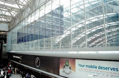
Constructed alongside an existing Waterloo Station, this new platform accepts the old Windsor lines. It includes basement car parking and a new train shed roof. The roof consists of 37 prismatic, three pinned bow string arches covering approximately 400 meters, the entire length of the trains. The upper pin of the arches is where the external inverted truss with twin tie rods convert to an internal bow string truss with a single lower tie rod and twin large diameter steel tubes at the top. The roof effectively follows the stress diagram for the structure, and responds well to the movement in the supports. Posted by Picasa

Tokyo International Forum

Tokyo International Forum
Demonstrated System: Steel Trusses
Architect: Rafael Vinoly
Location: Tokyo, Japan
Date: 1989 competition, completed 1996

With eleven above ground stories and three below ground stories, the Tokyo International Forum is the first art center in Tokyo. It is a composition of four buildings, each one with a unique hall; the Glass Building houses the atrium. The Forum itself covers an area of 20,951 square meters with a total floor area greater than 145,000 square meters; this is distributed amongst the 33 conference rooms and 7 multisized halls. The atrium receives an interesting effect by suspending semi-circular steel girders between the glass and steel walls. Posted by Picasa

Gund Hall

Gund Hall
Demonstrated System: Steel Trusses
Architect: John Andrews
Location: Cambridge, Massachusetts
Date: 1968 to 1972

Gund Hall is the graduate architecture school at Harvard University. Designed by Australian architect John Andrews, it features stepping sky-lit collective studio spaces spanned by sloping long trusses which cover five stories. The building itself has a capacity of approximately 500 students and more than 100 faculty and staff. Posted by Picasa

Central Railroad Station

Central Railroad Station
Demonstrated System: Arches
Architect: John Dobson
Location: Newcastle-on-Tyne, England
Date: 1846 to 1855

Newcastle was a town originally colonized by the Romans, and at the time of construction was a prosperous town. Three lines of train track converge here, curving along an embankment and cutting through the entire city. Each group of rails are spanned by separate 60ft high arches. This creates a tripartite composition; of particular interest is the elevated cross-track passerelle and the top lighting provided by the glazing on the roof. Posted by Picasa

Louisiana Superdome

Louisiana Superdome
Demonstrated System: Dome
Architect: Curtis & Davis and Associated Architects
Location: New Orleans, Louisiana
Date: 1970 to 1975

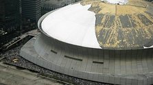
Covering 13 acres and reaching 27 stories at its peak, the superdome provided refuge for a deluge of refugees following Hurricane Katrina and previously housed the NFL's New Orleans Saints before being shut down. The dome itself spans a diameter of 680 feet, covering a total of 9.7 acres, and has an estimated wind load capacity of approximately 200 mph. At the time of construction, it was the largest fixed done in the world. In order to fit it on the site, the Girod Street Cemetery was demolished. Posted by Picasa

Rose Center for Earth & Space

Rose Center for Earth & Space
Demonstrated System: Skeleton Framing
Architect: James Stewart Polshek
Location: New York, New York
Date: 2000

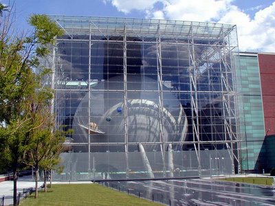
Attached to the Museum of Natural History in NYC, the new Rose Center replaced the Hayden Planetarium previously there. The new center features a large spherical structure which acts as a theater space. Along the perimeter of the cubic space are platforms featuring exhibits and views to the central space below. The exterior is supported with a series of columns and associated girders and beams. With full height low-e glazing, this skeleton system allows light to enter the space while reducing solar gain in the main space Posted by Picasa